James Turrell's work consists of mainly color and light. He does a combination of mood/scene manipulation, as well as creating images or vibes with set lighting. Turrell also uses extensive cropping, as to rid his images of distractions in the background, and create a sense of absolute nothingness, making the only real subject matter in his photos be the color themselves. A lot of his photos consist of capturing patterns, often times being hard for the viewer to figure out what they are looking at, sometimes looking like a drawing or a movie set when in reality it may be something like a keyhole or a pattern on a wall.

This first image almost looks like something made in photoshop or Adobe Illustrator. The sheer simplicity of it is extremely fascinating, and the use of sharp edges is also very nice in keeping the photo clean. There is very little, if any grain, and the image itself was taken at precisely the point where all the lines are perfectly straight. For me, my eye was drawn towards the blue, then seeing the slightly busy detail of the room where the skylight is over. Admittedly one may argue it is distracting, but the variation and slightly overwhelming textures of this shot really help bring out the fact that this is indeed a real photo, and not photoshop, or a drawing.
This Second image reminds me a bit of a music video. It looks to me like his main focus, or what he wanted the viewer to look at was the purplish cube in the center, and then look around at the rest of the image, seeing the walls, as well as the light reflecting off the ground, perfectly angled with the light on the walls. The symmetry in his images is extremely pleasing to the eye, and the use of colors and negative space is also well excecated. Unlike the image up top, the only major contrast would be between colors and the negative space rather than in the previous photo, the harsh contrast between yellow and blue. The execution of this shot had to have been measured to the exact placement of the camera, as well as angle. The image itself looks too clean to have been done without such attention to detail.
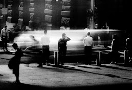
This last image uses contrast more than anything. The black against white, as well as the women wearing white is no mistake, as well as their placement in the image at right about the thirds line to the left. I think one issue I find in this image is that with such a modest approach is the lack of consistency in whites, as one of the women is wearing a beige/off-white dress, that I feel distracts from the attempt to have them match the white ceiling above. The lens used is most likely a very wide angle, as it seems to capture the entire room in one frame, and seems to stretch the skylight, which may in person actually be circular. Overall the composition and use of contrast is fantastic, but that one inconsistency with the woman's dress, although to some is a minor detail is distracting. For all I know it may have been done on purpose to have attention drawn to the way it sort of sticks out.


Comments
Post a Comment