Posts

Christian Marclay

Image
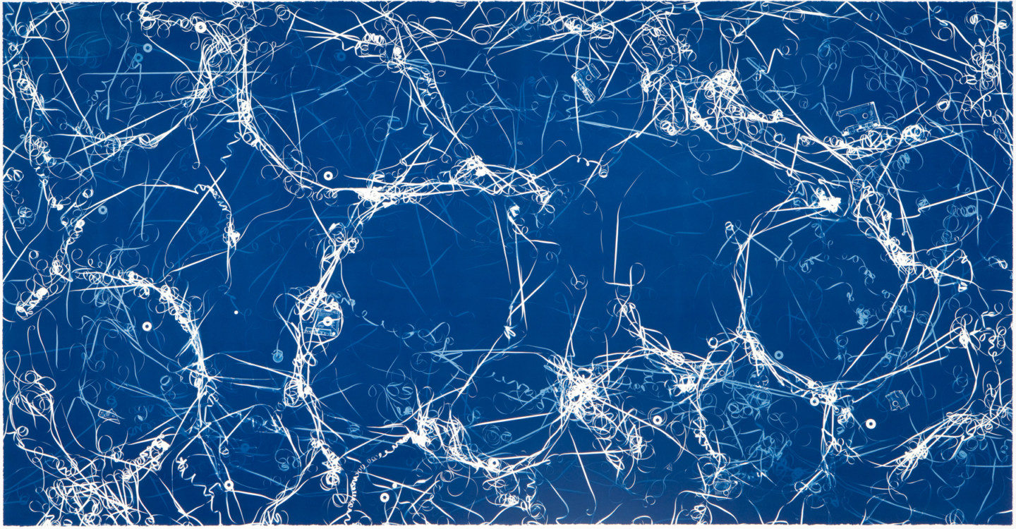
 Christian Marclay is a photographer who uses many different processes, one of which being the Cyanotype. Marclay's works are simple in terms of form, mostly done on paper, but the images he creates are truly marvelous, and on quite a large scale too, which is something I liked... a different sized canvas. This first image is of tape reels splayed out across cyanotype paper. There are many different transparencies, and there is a sense of chaos. It sort of reminds me of nerve structures. The way Marclay can capture so many of these reels is through his use of a larger canvas size, and a proper exposure, as these films are more often than not slightly to very transparent depending on whether or not they've been developed, or just left as blanks. This next image inspired one of my pieces heavily with the heavy imprint of an object and it's recognizable form, Marclay with old tapes, and I with photo reel wheels. (I forgot the proper name for them...) This image at first site l

Chemical Paintings: Chuck Kelton

Image
 Chemical Paintings: Chuck Kelton's chemical painting works resemble that of classic landscape paintings. Of course, chemical paintings are a lot harder to control than that of an actual painting. His work is abstract, each piece a one of one masterpiece. What I wonder is are these images and results calculated to a degree, or does Kelton just try stuff and hope it works? This first image resembles that of a cloudy sunrise over the mountains, with a lake underneath. The use of fix, stop, and developer all forming different layers in the sky, mountains, and landscape. The fact that Kelton is able to create such vibrant and controlled colors with such an unpredictable process is absolutely astounding. Something tells me he knows what each chemical does to the paper. I wonder if these images combine chemogram and photogram techniques to get his results. This piece comes across as being on the more experimental side compared to the previous piece. Kelton makes a very foreign and more a

John Dugdale

Image
       John Dugdale is an American photographer who deals mostly in cyanotype processes. Dugdale's images are very much so unlike your standard cyanotype where you see the shape of a flower or an object on a blue sheet of paper. Dugdale's images have absolutely stunning contrast, and are made using what seems like massive negatives. One things that intrigues me is how he actually goes about exposing the images. Does he use something like a projector? Or does he expose them to the suns with negatives as big as the paper? Most of his images are self portraits, many of which were taken while Dugdale was losing his sight due to complications with a stroke and an HIV related Illness.       Dugdale's works often involved a sense of suffering, or a theme of death. I think the reason the Cyanotype attracted Dugdale so much was due to it's somewhat hazy nature, and the fact that the images were blue. It was very easy to make sad images for Dugdale, expressing the trauma and how

Phillipe Halsman

Image
 Phillipe Halsman was an American Photographer. He was well known for his portrait work with many well known artists, famous thinkers, and popular figures at the time. Most of his portraits brought out the sillier and more whimsical side of his subjects for the most part, really making his images stand out amongst the many others of the same people. Halsman always knew how to pose and portray, regardless of his subject. Just looking at the image could tell you what kind of person you were looking at. This first image is a portrait of Jean Cocteau, a French poet. Upon looking, there is a sense of confusion as Cocteau is portrayed with multiple arms, carrying a pen, a book, a cigarette, a pair of scissors, a paint brush, and an empty hand at his side. There's a reason Halsman gives him all of these things, as well as all of these arms. It says something about how busy or crazy of a life Cocteau has, maybe it represents the little bit of free time he has, or it shows that he's so

Hiroshi Sugimoto

Image
 Hiroshi Sugimoto is a Japanese Photographer who works primarily in black and white/analog photography. He is most well known for his long exposures in movie theatres, as well as his series "Seascapes." Today I will be focusing more on his work from Seascapes, and his self portraits as I've already covered Sugimoto's long exposure theatre work a while ago. This first image by Sugimoto relates to his work in the theatres with long exposure. He looks to have made himself a viewer, captivated by whatever is going on on the screen. Sugimoto's use of heavy reflection makes me feel like he is interpreting himself as a character from his long exposure works. Capturing a proper negative for this image must have been rather difficult, as well as making a good print for it too. I'm curious how much of this image was due to how the negative was created, and how much of it is heavy darkroom work. Most of the image is very underexposed besides his face, clearly doing what

Christian Vogt: A Strange Style of Portrait

Image
 Christian Vogt, a Swiss photographer known for his portraits catches my attention with rather strange images. The way he captures the human form rather than the human being itself is something very unique that I haven't seen before. His images sometimes come across as very surreal, and somewhat outrageous, or even just outright strange.  This image features a man holding a rock to his face, blocking the viewer from seeing the model. The positioning and angle of the arms looks like a natural rock formation if you aren't paying attention, which I think was Vogt's intent. He turns the human body into shapes, and things by obstructing the familiar parts, making the viewer disassociate the body as a person. Compositionally the image is very nice. The slight off centered positioning adds a bit of drama to the shot, and the perfect timing of the cloud, similarly shaped to the rock in the top left corner really helps fill the frame. This next picture features a portrait with hands

Yousuf Karsh: The Portrait

Image
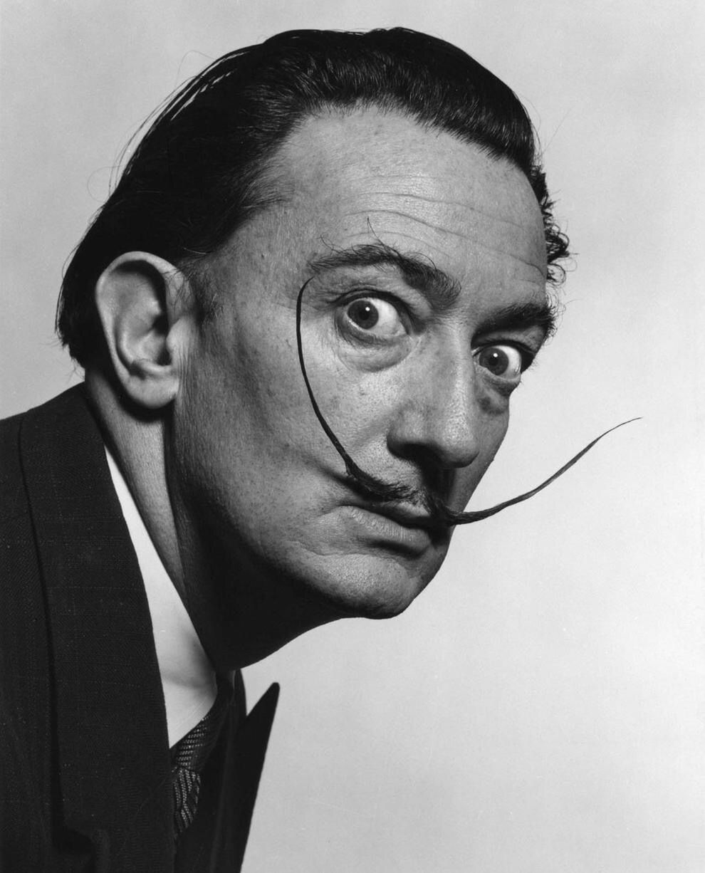
 Yousuf Karsh's portraits are some of the most iconic ones known to date. He has a distinct style, and use of posing. He seems to have excellent control, as well as understandings of his subject's personalities. He portrays them all with their own aura in a sense.       This first image of Salvador Dali is one of those iconic pieces. Dali is portrayed as a rather silly and whimsical person, as he should be. Being known for his surrealist works, Karsh makes Dali look surreal himself. The wide eyed stare, and the show of his rather crazy mustache gives off the impression that Dali wasn't a very norm conforming man. The simple white background contrasts the sort of funny look of insanity on his face, as well as the suit and tie, contrasting Dali's very colorful personality. The piece truly has a conversation with the viewer about who Dali is.      Karsh's portrait of Albert Einstein is also an extremely iconic image. The choice of positioning, the use of hands being fo